Showroom to Screen: Redesigning an eCommerce experience to match a premium brand
Overview
Oakleys' old site was holding them back - visually outdated, hard to manage, and disconnected from their premium showroom experience.
I led a modern redesign that brought their brand to life online, and made it easier for customers to explore and engage with their products.
The problem
Oakleys Plumbing's online presence felt dated and disconnected from their physical showroom experience. The site had visual inconsistencies, technical limitations tied to their old CMS, and lacked the ability to effectively showcase their products.
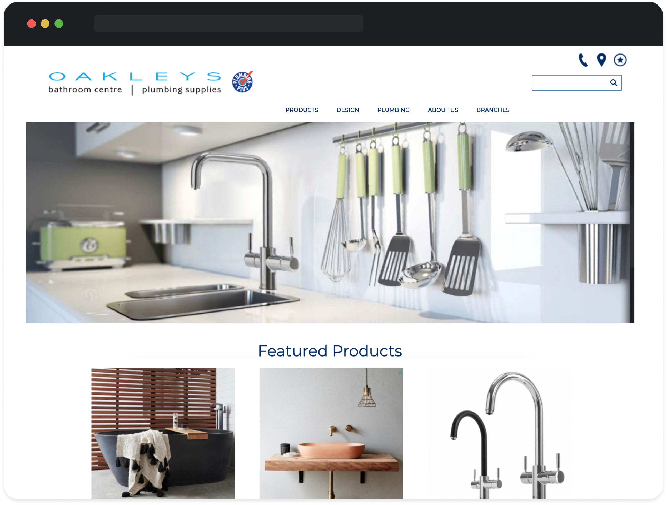
Oakleys Plumbing original site
Goal
Create a modern, user-friendly website that showcases Oakleys high-quality products and projects, aligns with their in-person showroom experience, and introduces a streamlined quoting system to support customer engagement.
Process & approach
Oakleys operated four showrooms around the South Island which were all run somewhat independently, but still tied to their main Christchurch showroom. Their Marketing Manager came to us with some pretty clear guidelines on how they wanted the site to work - it should be four separate duplicate sites, with each one managed separately, but with a central office admin management.
While this approach made sense operationally, it created complexity in website management, product ordering and inventory, seo implications, admin, and the ongoing costs. To help them visualise this, I mapped out two proposed information architecture diagrams: one for their initial approach, and one for a unified site structure with four clearly defined locations under a single domain. After walking through the pros and cons, they were aligned on consolidating to one central website.
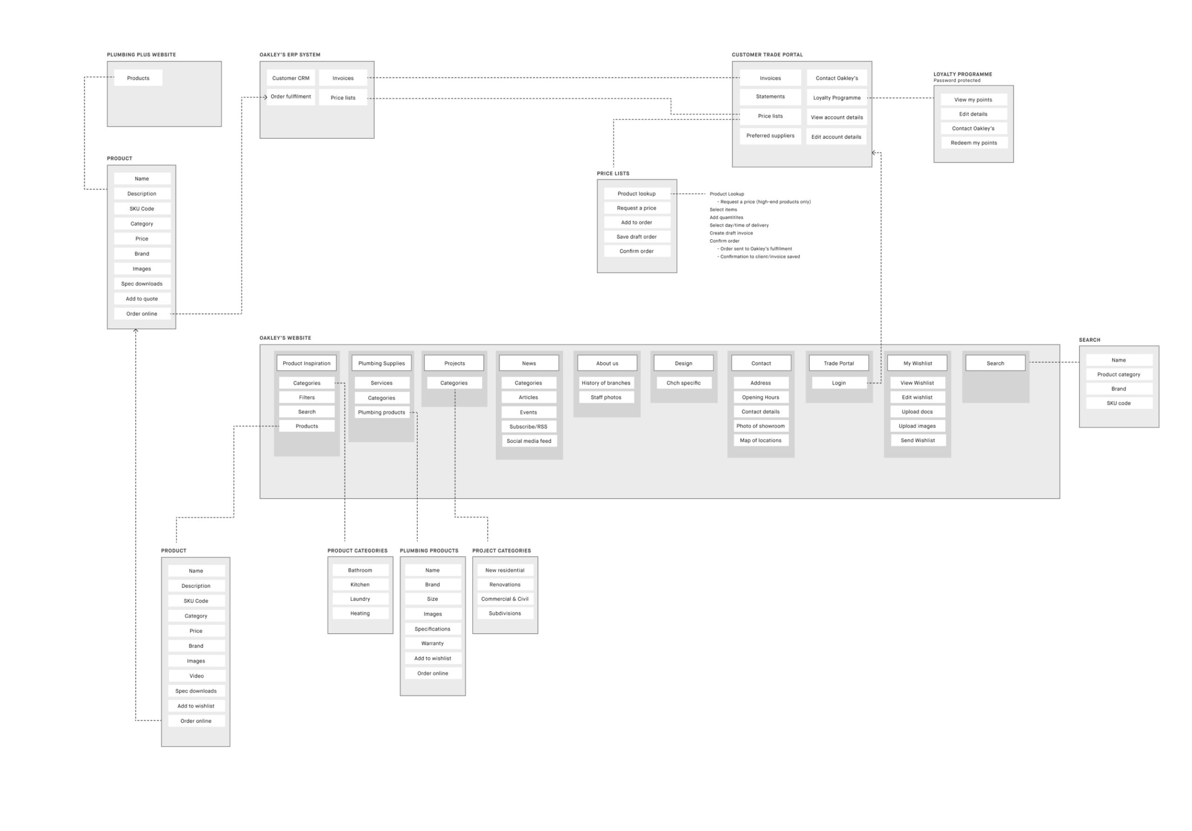
Information architecture diagram
With the new information architecture agreed on, I created a set of wireframes covering the key pages - guided by both the revised sitemap and a comprehensive requirements list provided by the Marketing Manager, who had done a pretty solid job researching competitors and outlining must-have features.

Site wireframes
Brand positioning
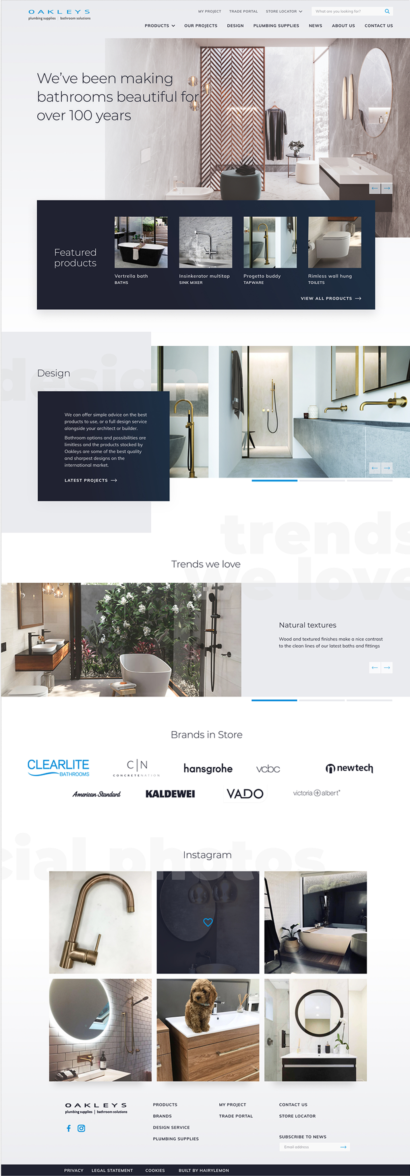
After visiting Oakleys’ showrooms, I developed a refreshed colour palette that extended their mid-range blue with a deeper blue-black and muted greys. I presented a design reflective of contemporary home and architecture magazines, and the palette created a clean, modern backdrop that complemented their product photography and elevated the brand’s premium feel online.
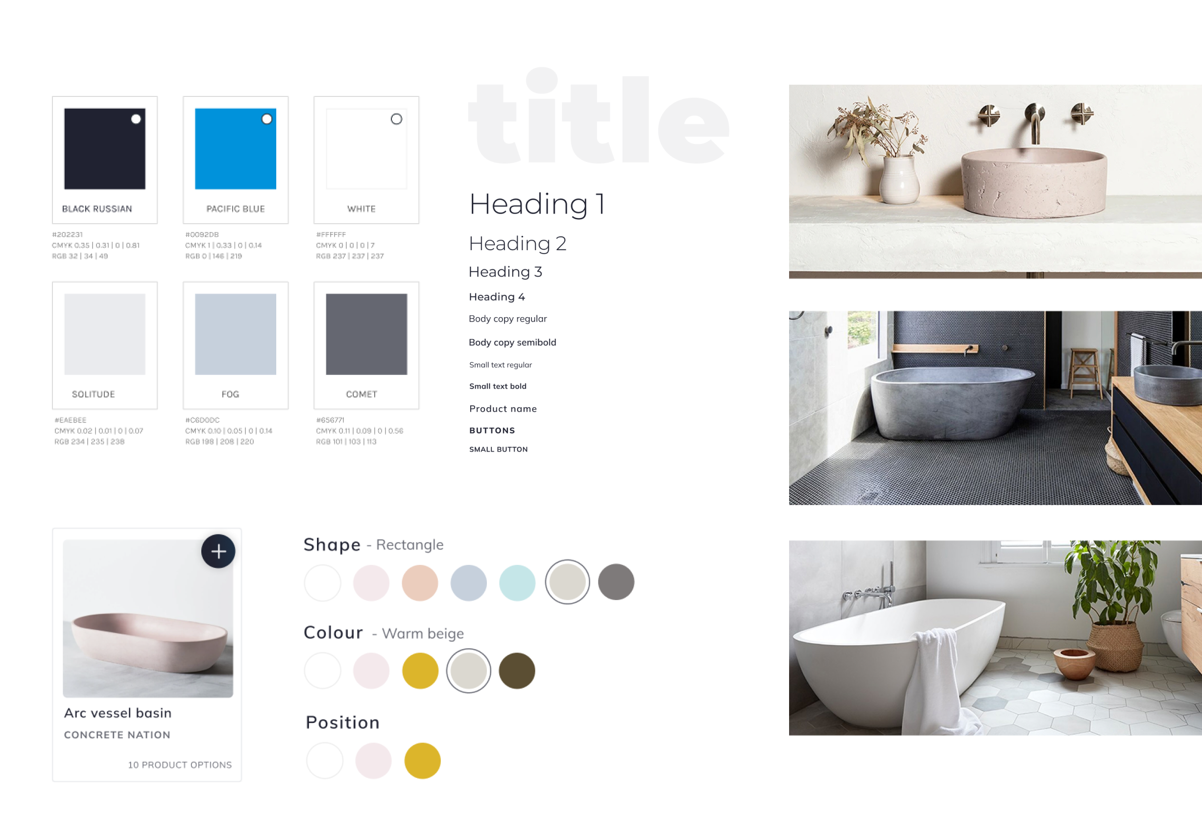
Lean brand direction
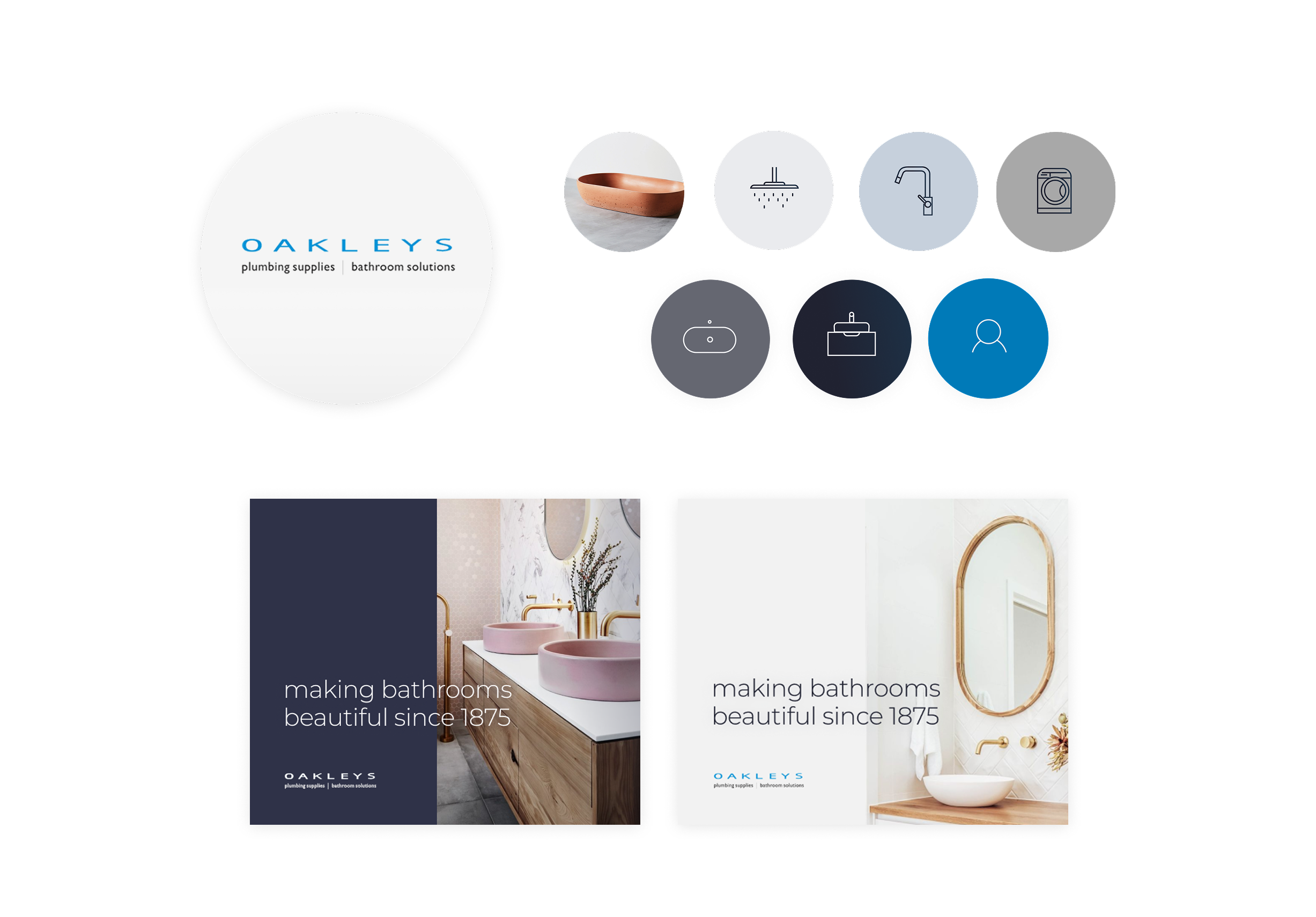
Icons and mockups for social platforms
Design solutions
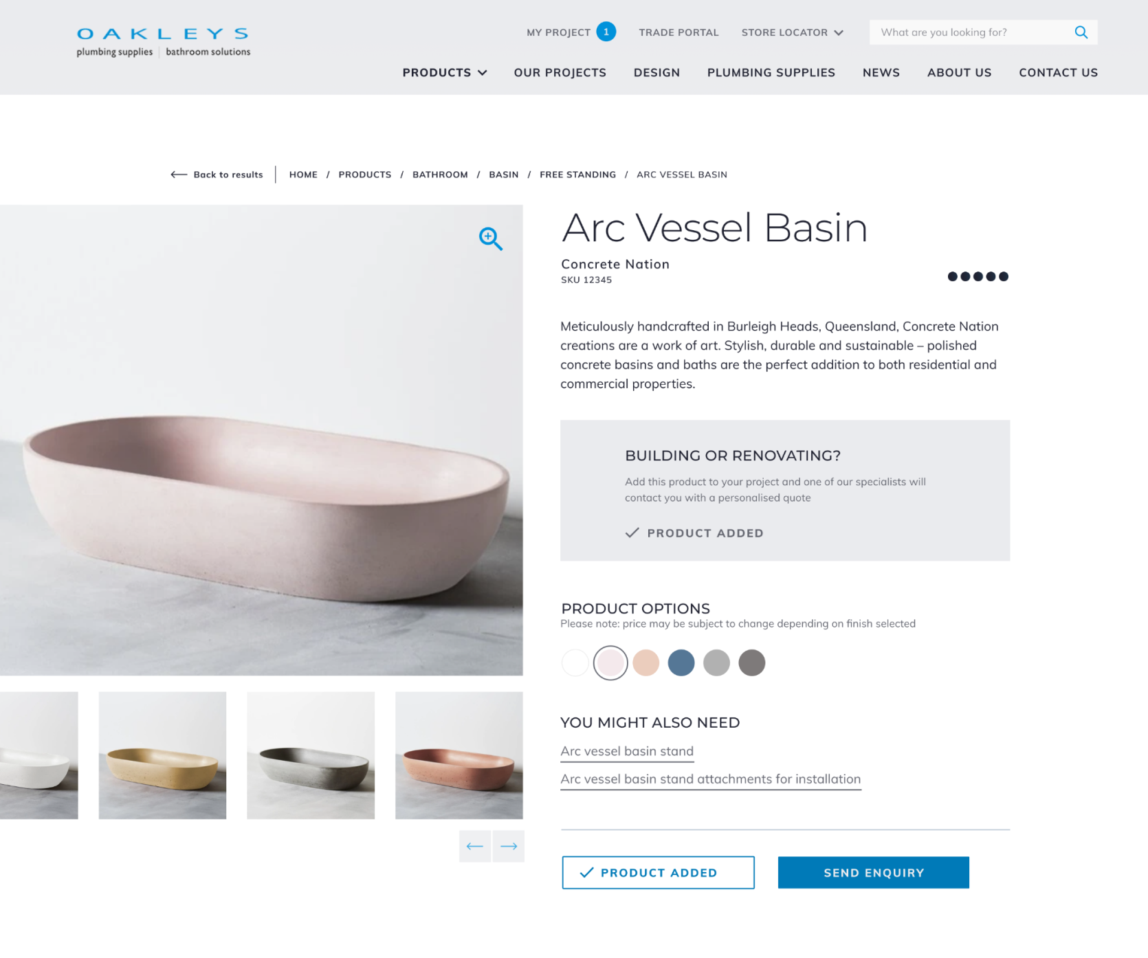
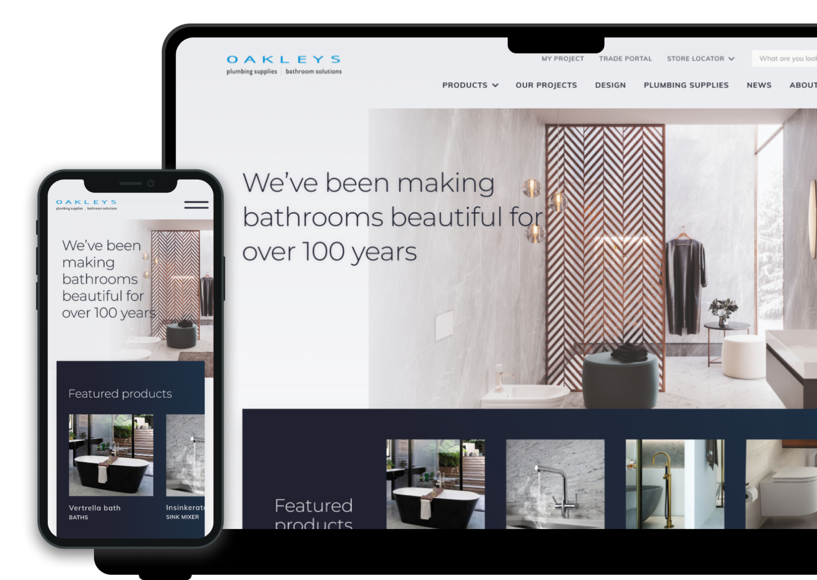
Once aligned on the direction, I mocked up high-fidelity designs for all key pages, utilising their beautiful product photography and the simple brand identity we had established. As I worked through the designs, I regularly checked in with the client for feedback. Aside from some minor tweaks on terminology, everything was approved quickly and we kept momentum right through to handoff.
Outcomes
- Delivered a strong online presence that matched Oakleys’ premium positioning
- Simplified management with one centralised website for all locations
- Established the wishlist functionality as a future foundation for ongoing customer engagement
- Positive client feedback and quick approvals thanks to close collaboration
Reflection
I moved on from hairyLemon just as the initial site was going live, but missed the development and release of the project wishlist functionality.
What worked well
- Engaged stakeholders meant the feedback loop was quick and productive
- Clear requirements and direction from the outset made it easier to stay focused
- We delivered a strong digital presence with a lean but effective brand identity
Challenges
- The team’s enthusiasm brought lots of new ideas, so we had to keep an eye on scope and budget to stay on track
More projects
Brand intelligence: Surfacing hidden patterns to prevent repeat mistakes
A strategic design project that reframed the problem and proposed a smarter, AI-informed solution to reduce repeated brand mistakes in production.
View project →
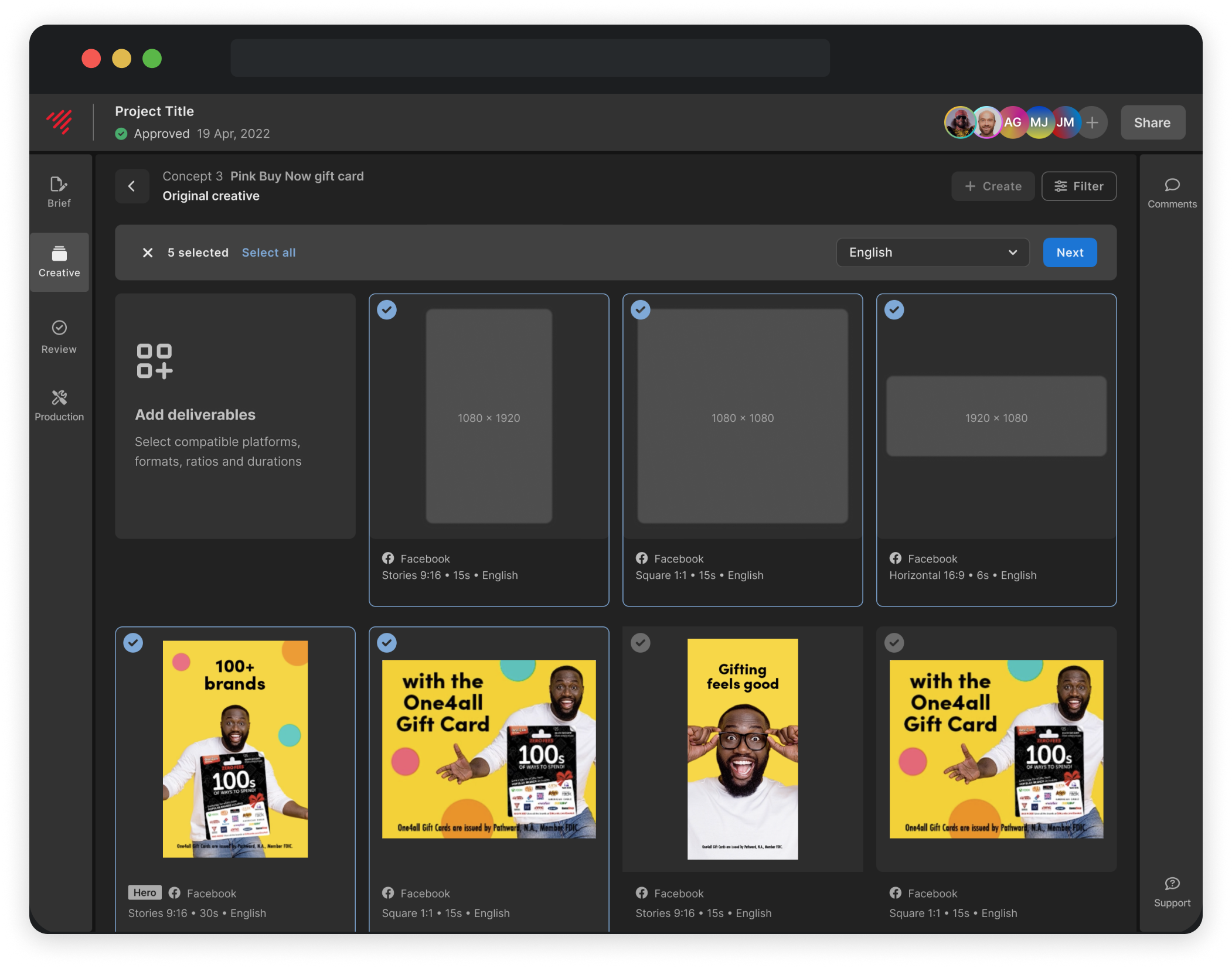
Variations: Designing a faster way to scale approved creative
A new flow that lets users scale from approved creative, without starting a new project. Now powering more than 40% of all creative through the platform.
View project →
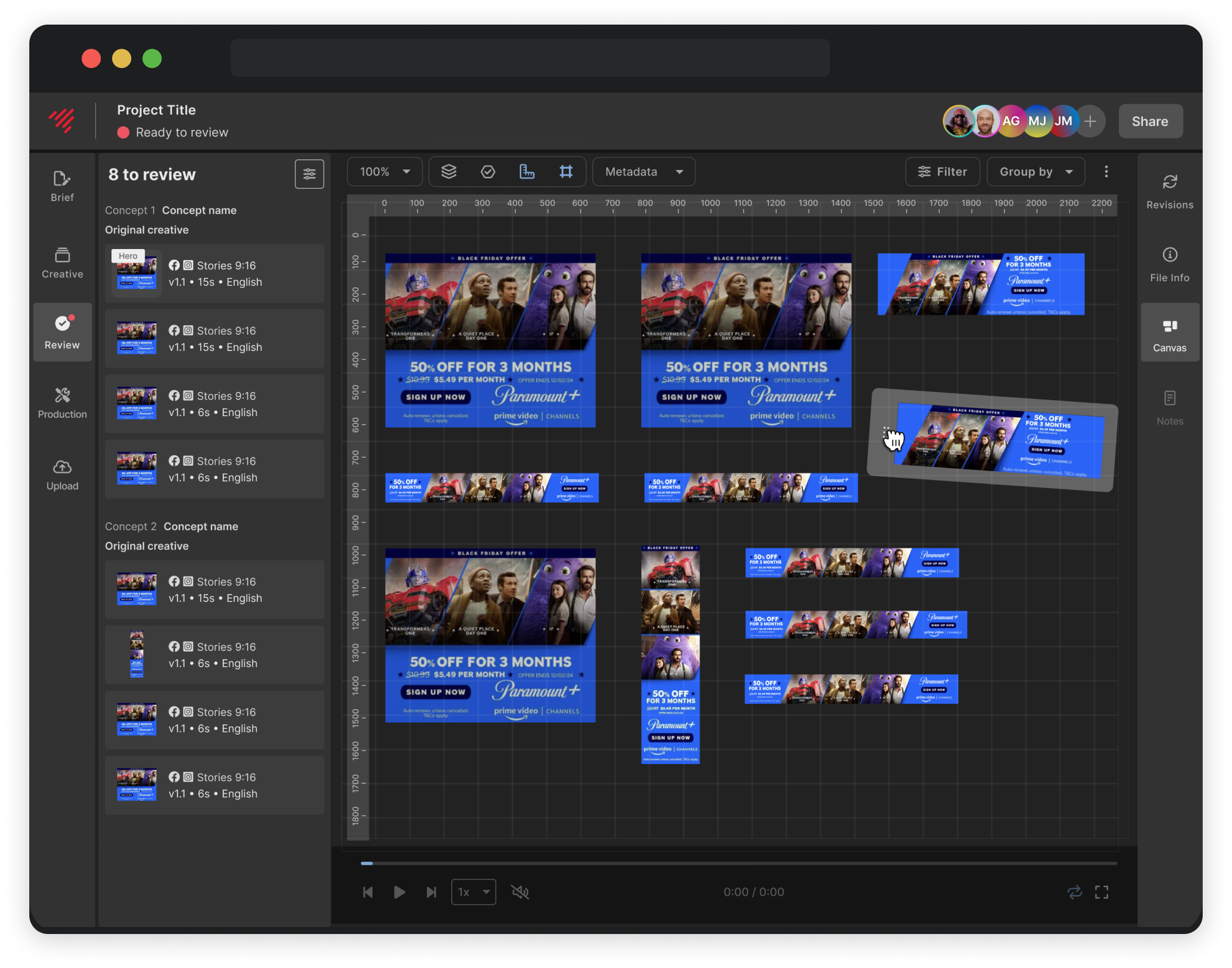
Canvas: Designing a multi-view QA tool to simplify creative review
A new multi-view QA tool that improved review speed by 30% and replaced slow, error-prone workarounds
View project →