From ambiguity to app store: Defining the vision for a UGC experience
Overview
I was asked to mock up a vague idea for a content creator app, with no real product vision or defined requirements. Needing to turn this around fast, I shaped the entire experience: from sign-up and profile creation to viewing and accepting briefs, and uploading content.
I also wrote the content, set the tone of voice, sourced illustrations, and helped establish a distinct identity from our core platform. The thinking and flows became the blueprint for what shipped, and brought two product teams together with a shared direction.
The problem
Stakeholders wanted to explore an app for content creators, but no one could say exactly what it should do, how it would work, or how it should differ from our existing platform. The only knowns were: it should let creators sign in and view/accept briefs
The challenge: turn vague ambition into something concrete.
The goal
Streamline creator onboarding, take advantage of the early days of UGC, being one of the first to have a standalone app. and reduce manual and email-based workflows
First concept before POC was approved
Discovery & direction
After the initial POC was approved by SLT and a decision made we would build a standalone app, we needed to get the full app experience mocked up for the engineering teams to make a start on. All other work was on hold, and both product teams were combined to get the app out the door as soon as possible.
I met with the customer team currently manually onboarding creators, and collated as much information quickly as possible:
- Spoke to brand and sales about how creators currently work with us
- Looked at common pain points (e.g. unclear briefs, inconsistent profiles, manual handoff)
- Mapped a minimal end-to-end journey for creators, from onboarding to submission
- Worked with the engineers to map out the registration flow, navigating creators pre-registered and new creators
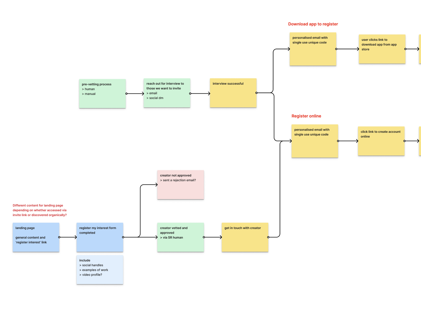
Registration and creator creation flow
Key flows I designed
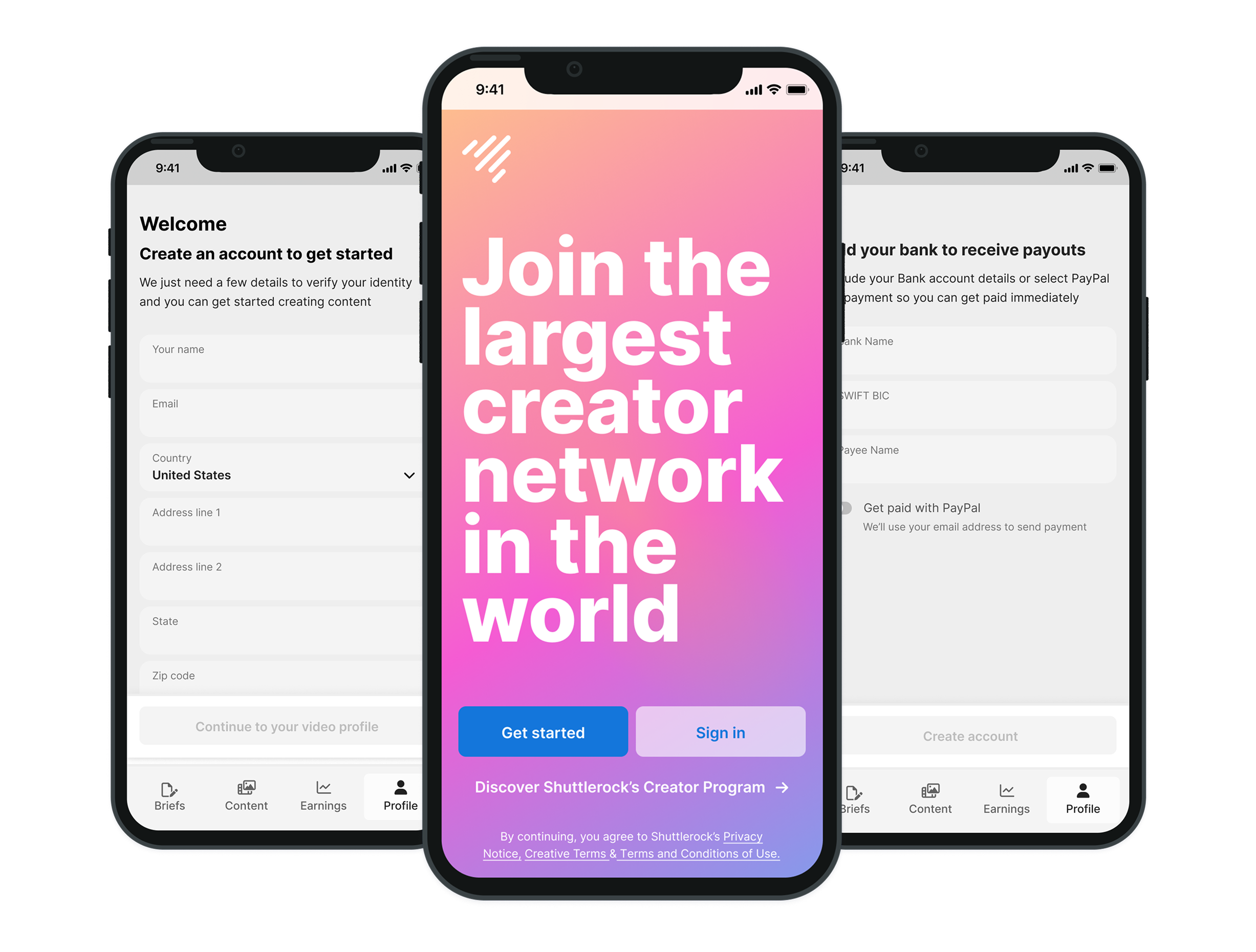
Sign up & onboardingA simple, mobile-first flow with profile creation and required info for qualification
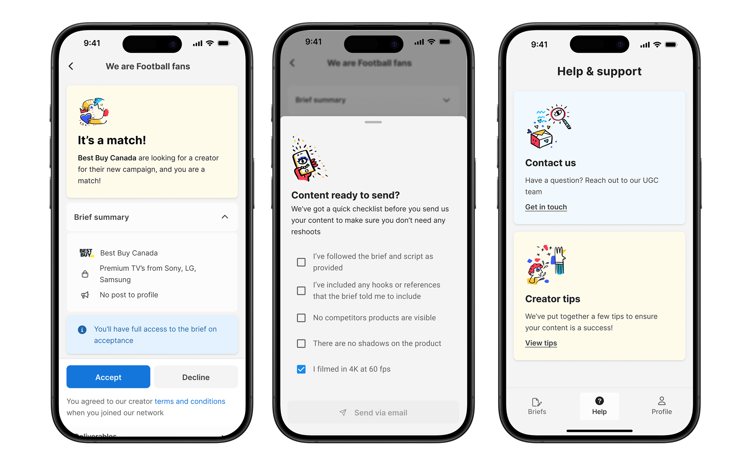
Brief review & acceptanceCreators could browse briefs, view requirements, and accept or decline with one tap
Upload & deliveryA clear checklist to upload creative, view submission guidelines, and complete delivery
Post-submission & supportHelp content, visual feedback, and earnings built into the flow to reduce follow-up emails
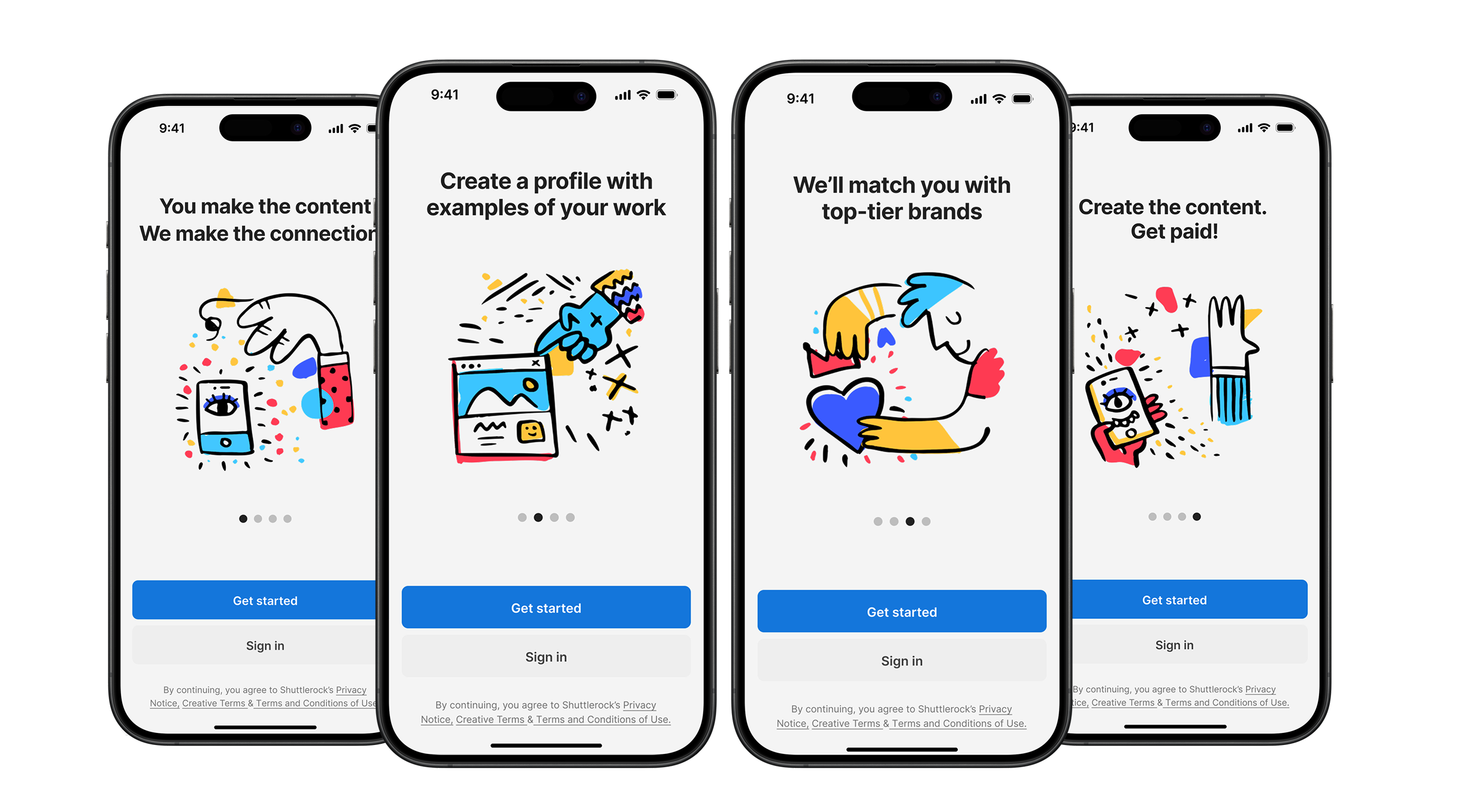
Entry screens with sourced illustrations to support the story
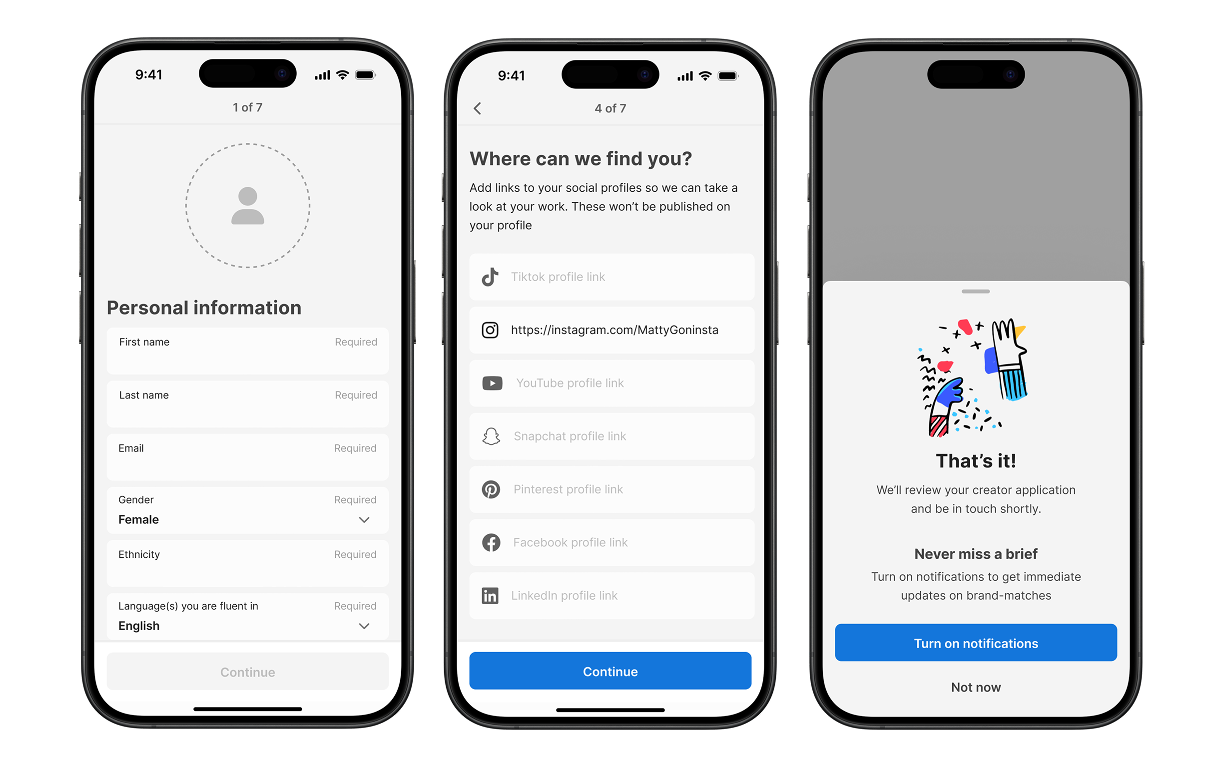
Create profile flow
Briefs and help screens
Voice, content, & visual direction
Because this wasn’t branded Shuttlerock, I had to work quickly to pull together a visual direction for SLT reviews. I presented a couple of iterations as the flows developed. Once it was clearer we’d be building a standalone iOS app, fleshed this out and I also:
- Wrote all in-app copy - aiming for a helpful, informal, human tone
- Sourced illustrations and helped create a distinct visual language
- Added additional suggestions for future enhancements - best practices, gamification, checklists
Outcome
- My initial concept and flows became the blueprint for what shipped
- Two product teams aligned around a shared vision and collaborated on the build
- The final app combined my early design work with future iterations from both teams
- Creators now use this flow to sign up, accept briefs, and deliver content at scale
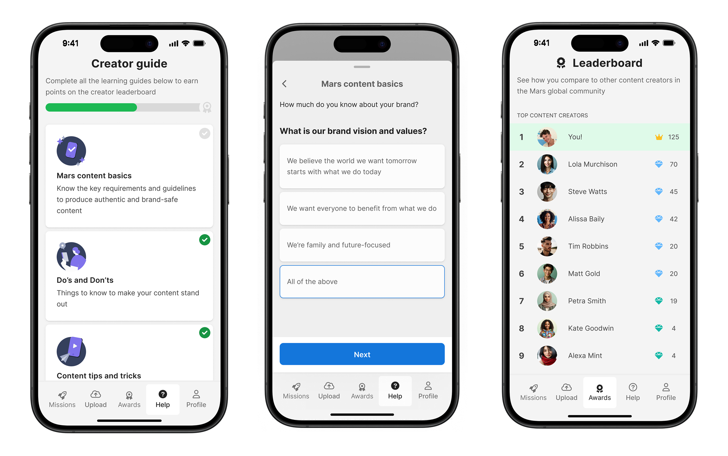
Mockups of gamification-type flow - creators learn more about their brands to move up the leaderboard
Reflection
This was one of those rare ‘blank canvas’ projects - no guardrails, just a problem space and a lot of ambiguity.
It reinforced my strength in shaping early product vision and bringing structure to fuzzy ideas. It also gave me a deeper appreciation for voice, tone and storytelling - especially when designing something community-facing and standalone.
More projects
Variations: Designing a faster way to scale approved creative
A new flow that lets users scale from approved creative, without starting a new project. Now powering more than 40% of all creative through the platform.
View project →
Canvas: Designing a multi-view QA tool to simplify creative review
A new multi-view QA tool that improved review speed by 30% and replaced slow, error-prone workarounds
View project →
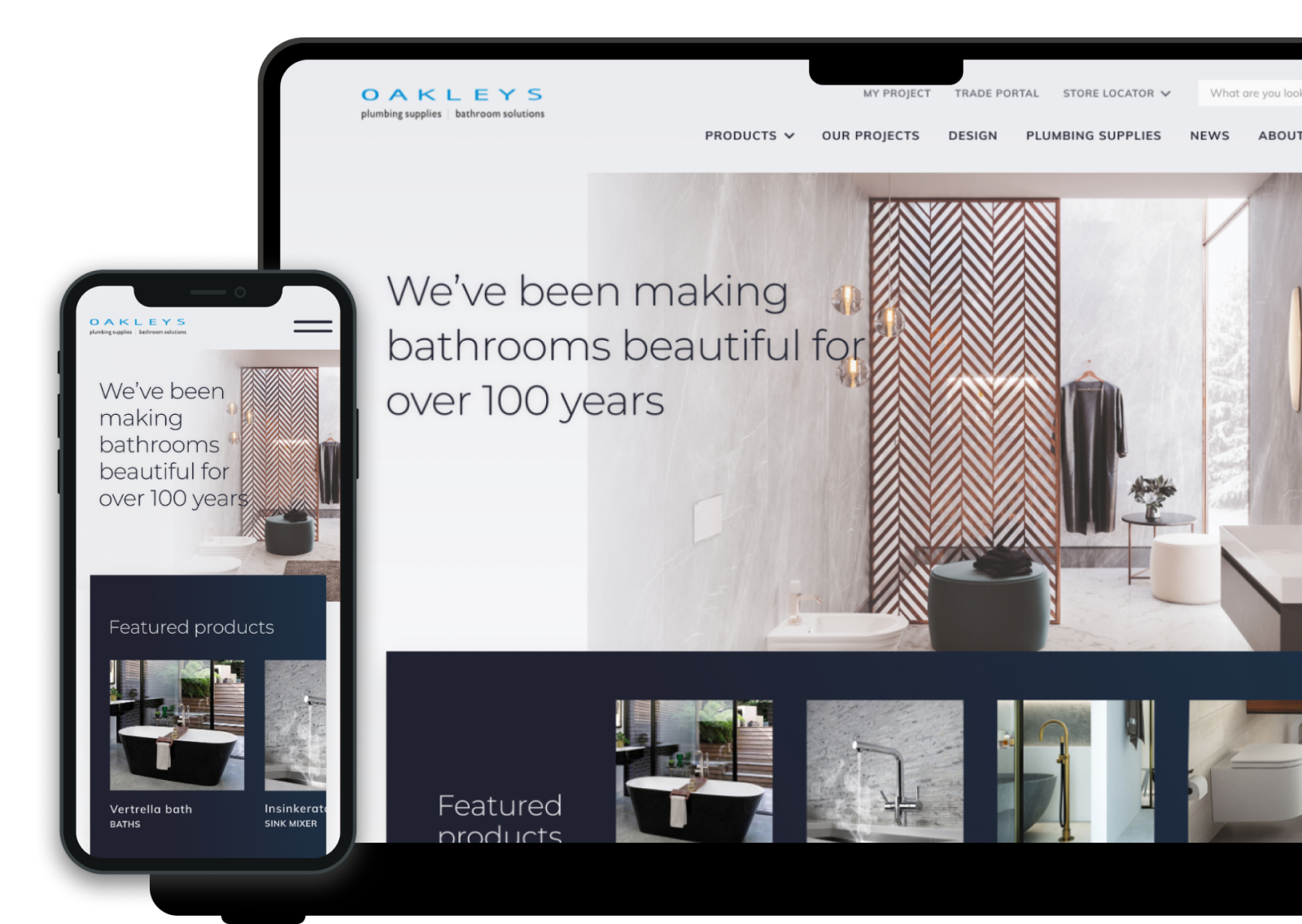
Showroom to Screen: Redesigning an e-commerce experience to match a premium brand
A modern e-Commerce redesign that brought their brand to life online, and made it easier for customers to explore and engage with their products.
View project →